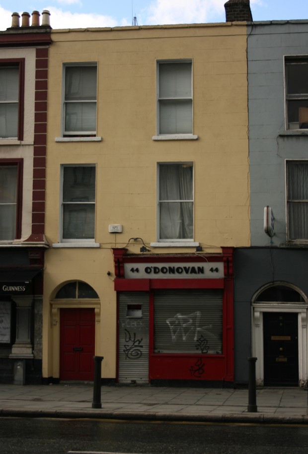
There’s something about O’Donovan’s shopfront that makes it seem like it’s in miniature. It’s not, really, and the three-storey building around it isn’t very imposing either, but it’s an interesting illusion.

Part of it is probably the ground-floor level division, with the shop occupying a little over half the plot width. Plenty big enough for a deli and newsagent, but made to look smaller by contrast with the street’s wider shops and pubs.

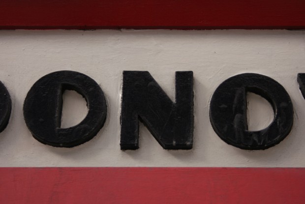
This is definitely reinforced by the sign. Even if it were flat, the thick diagonal stress of the letters would make it look compressed, but the shadows around the wooden give it greater emphasis and fill it in more tightly. The half-filled ‘o’s are gorgeous, the apostrophe looks surprisingly juicy and almost in motion, and I love the uniform squatness of the ‘4’s. Looking closer, the uneven edges of the layers of paint give it a wobbly human quality that’s quite nice against the sharp (and foolproof) red/black/white combination.

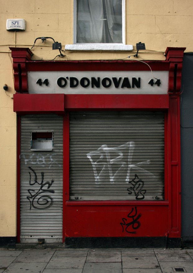
It’s an obvious point to anyone interested in shopfronts, but part of what makes this so strong visually to me is that it doesn’t have fifty other small signs all over it. When it’s open, notices in the windows change that a bit, but the frame still stands out as making a singular move, and it’s memorable for it.